Viewing and Editing an Existing Scorecard
To view or edit an existing scorecard, go to the Scorecard home screen and click the tile for the scorecard you want to view or edit. Note that the default scorecards, with the names "Safety" and "Fuel Efficiency", to the right of the Add Scorecard tile, cannot be edited. The dashboard for the selected scorecard opens:
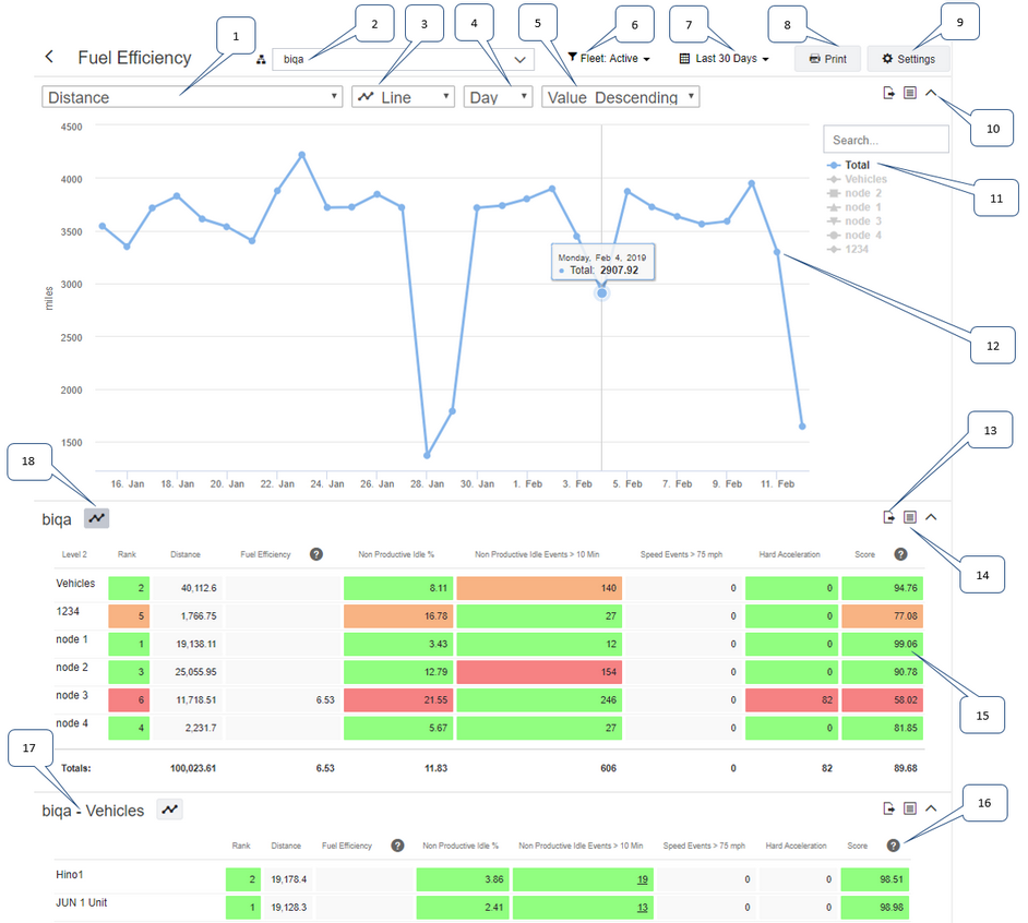
1: |
Select one of the metrics to display on the graph. |
||||||||
2: |
Select the type of chart:
|
||||||||
3: |
Use the hierarchy picker to search for or browse to a fleet or team within your hierarchy and then select the fleet or team. For vehicle scorecards you can select fleets and for driver scorecards you can select teams. When you drill down into the hierarchy and select a smaller fleet or team, fewer vehicles or drivers are included in the scorecard. |
||||||||
4: |
If you have selected a Line or Column chart, you can select the frequency for which to display data on the horizontal axis of the chart. The options are Day, Week, or Month. |
||||||||
5: |
Select the sorting order for the chart. The options are Name Ascending, Name Descending, Value Ascending, or Value Descending. |
||||||||
6: |
Use the fleet or team filter to narrow down the vehicles or drivers shown on this scorecard by fleet or team. For vehicle scorecards you can select fleets, and for driver scorecards you can select teams. This filter can be used in together with the hierarchy picker to show vehicles or drivers on the scorecard that are part of two fleets or teams. See Using the Fleet or Team Filter for example use cases. This filter is not available in all subscriptions. |
||||||||
7: |
Change the date range for which to display metrics and calculate scores. |
||||||||
8: |
Open the Print dialog box to change the print options and to print out the current scorecard. |
||||||||
9: |
Click Settings to edit the settings for this scorecard. You can edit the settings for scorecards that you have created. |
||||||||
10: |
Click the arrow icon to expand ( |
||||||||
11: |
The legend for the metrics shown in the table. The legend items for the metrics that are displayed on the chart are shown in color, and the legend items for the lines that are not displayed are grayed out. See Working with Multi Series Charts for information on how to show and hide specific metrics on the chart. Use the search to find items in a long legend list. |
||||||||
12: |
The chart displays the values for the selected metric over the selected time period. Hover over the data points to see the date and value. Depending on the setting for Default Series, the totals or individual metrics show on the chart by default. For example, if you have selected the line chart, either a single line showing totals or multiple lines showing the metrics in the legend display on the chart by default. Each line has a corresponding legend item. A maximum of 50 metrics can be displayed. This example shows a single series chart, displaying totals only. See below for an example of a multi series chart. If there is more than one table displayed below the chart, the chart shows the table with the Chart icon |
||||||||
13: |
Click Export icon |
||||||||
14: |
Click the Table icon |
||||||||
15: |
Each column in the table displays metrics for this scorecard with associated values. Depending on the scorecard's settings, these values are normalized for distance, normalized for number of vehicles, or not normalized. If you have drilled down to the lowest hierarchy level to display vehicles or drivers, you can click the metric values to reveal more information about them. See below for information on getting more details on metrics. If there is more than one row in the table, the cells are colored based on metric percentile rank and the colors assigned for each percentile group on the Settings page, if any. See Understanding Scorecard Percentiles for more information. |
||||||||
16: |
Click a column header in the table to display an arrow icon ( Click the help icon |
||||||||
17: |
A second table shows if there are individual drivers or vehicles in the hierarchy node that you selected using the hierarchy picker in the upper part of the screen. The first table shows the teams or fleets that are contained within the selected hierarchy node. |
||||||||
18: |
Click the Chart icon |
You can view the following types of charts on each scorecard:
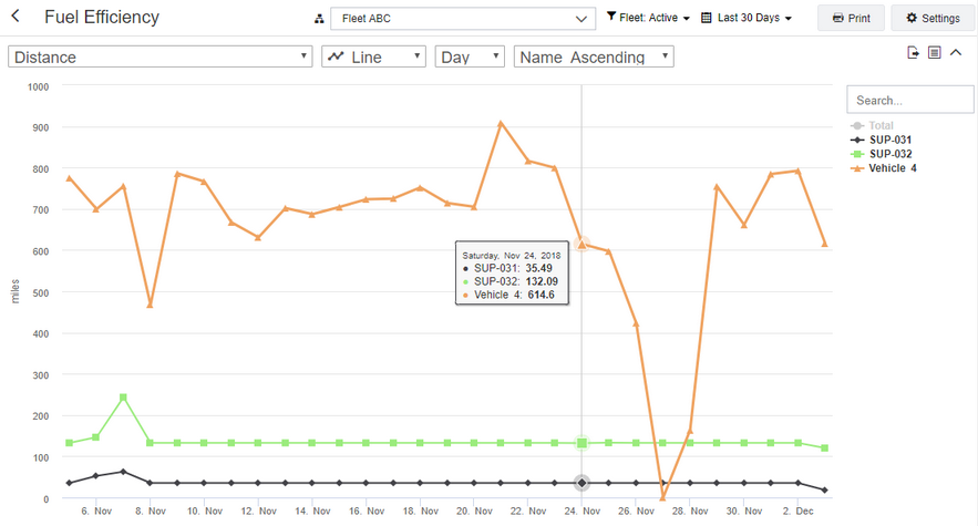
Line Chart
A line chart displays the selected metric over the selected time period. The time period can be per day, per week, or per month. A differently colored line displays on the chart for each selected item in the legend. You can order the lines by name or value. When you hover over a point, you can see the data for each metric for the particular day.
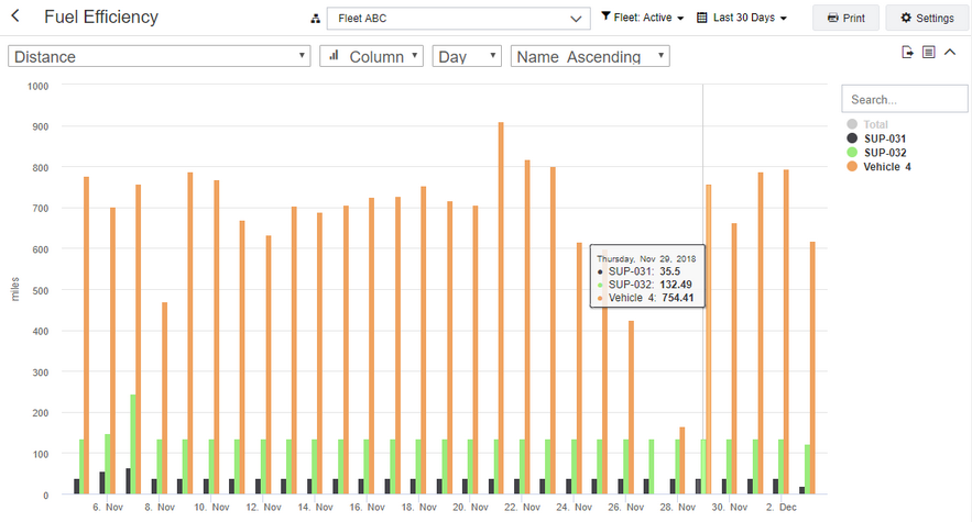
Column Chart
A column chart displays a column for each selected time period. The time period can be per day, per week, or per month. A differently colored column displays on the chart for each selected item in the legend. You can order the columns by name or value. When you hover over a column, you can see the data for each metric for the particular day.
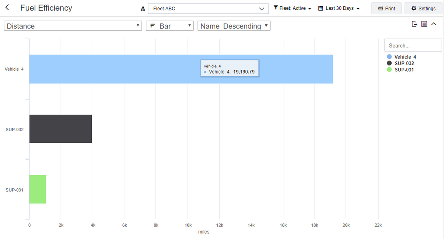
Bar Chart
A bar chart shows the totals of the selected metric for each fleet or team. Click an item in the legend to hide it from the chart. By default, up to 10 series are initially shown on a bar chart by default. Select more series to display them on the chart. You can order the bars by name or value. When you hover over a bar, you can see the data for the particular metric.
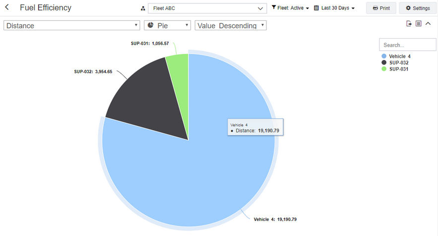
Pie Chart
A pie chart shows the totals of the selected metric for each fleet or team. Click an item in the legend to hide it from the chart. By default, up to 10 series are initially shown on a pie chart. Select more series to display them on the chart. You can order the pieces of the pie chart by name or value. When you hover over a piece of the pie chart, you can see the data for the particular metric.
To specify the date range to display, use the filter control located in the upper right corner of the screen. Click the date control to open the date filter, then select the date range to show in the graphs.
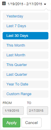
Pre-defined filter ranges include:
| • | Yesterday |
| • | Last 7 Days |
| • | Last 30 Days |
| • | This Month |
| • | Last Month |
| • | This Quarter |
| • | Last Quarter |
| • | Year To Date |
| • | Custom Range |
As you hover over each option the corresponding dates are displayed in the From and To fields.
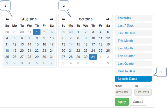
If you choose Custom Range, a calendar control opens. Use this to select the start and end dates of your custom date range. Click Apply to update the dashboard graphs.
Working with Multiple Series on Charts
Below is an example of a multi series chart:

This chart displays a line for each entry in the table, with a corresponding legend. It does not show totals. You can click a legend item to hide the selected line. Click the same legend item once more to display the line again.
Line and column charts behave in the same way: Depending on the setting for Default Series under Charts, either totals only or all series except for totals are displayed by default. Bar and pie charts display up to 10 series initially. You can click additional legend items to show the series, or click selected legend items to hide the series. A maximum of 50 series can be shown on the graph.
Getting More Details on Metrics
To get more details on a particular metric value:
| 1. | Drill down to the lowest hierarchy level using the hierarchy selector in the upper part of the screen. To do this, click the hierarchy selector and either search for the node or expand the hierarchy nodes until you have reached the lowest level. Select the appropriate fleet or team.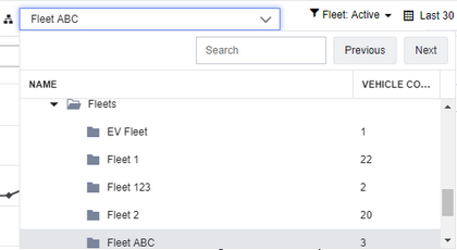 |
| 2. | The graph shows the total metric values for this hierarchy node. The table shows the metric values for the drivers or vehicles in the selected hierarchy node.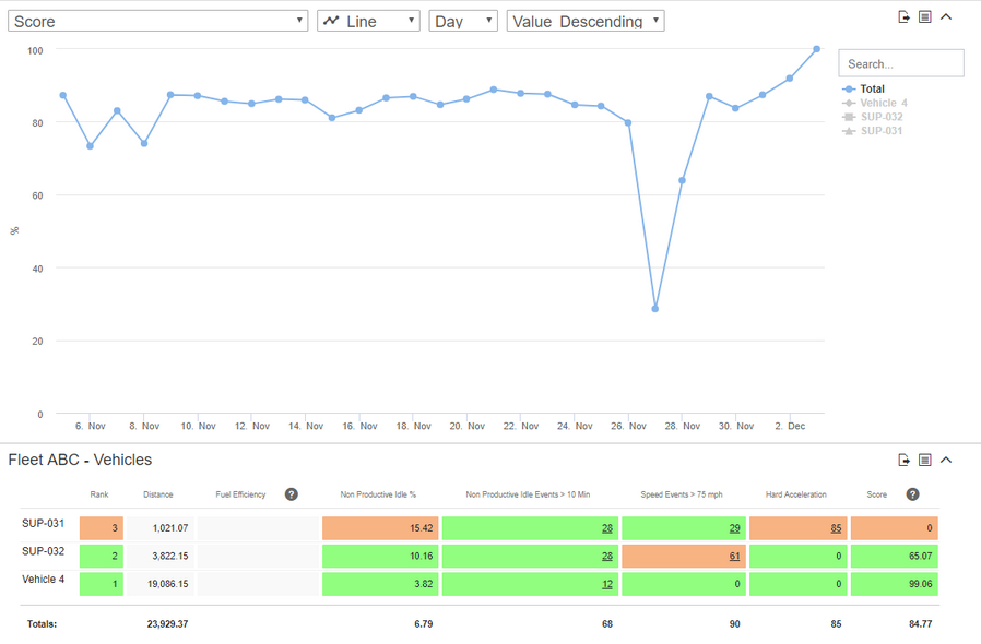 |
| 3. | Click an underlined metric value in the table to show specific events. The table contains different information, depending on the type of event. |
| 4. | Click the vehicle name to show the event on the Map screen. The history layer is displayed on the map, highlighting the trail that the vehicle took when the event occurred. |
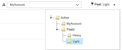
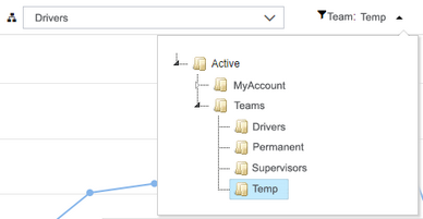
Using the Fleet or Team Filter
|
The fleet or team filter is option-controlled and might not be available in your account. |
Your Scorecard screen might have two controls for selecting vehicles or drivers.

In most situations you would use only the hierarchy picker to select the hierarchy node, or fleet or team, to narrow down the number of vehicles or drivers to show on the scorecard. In some situations you might want to narrow down your vehicles or drivers in more complicated ways than simply by hierarchy node, or fleet or team.
Below are two example use cases for using both controls to view scorecards:
Example 1
You are using the Hierarchy screen to sort your vehicles geographically. At the second level of the hierarchy you have states, such as California and Texas. Within each of these nodes you have nodes for cities, such as LA, San Francisco, Austin, and Dallas.
In addition, you are using the Fleets & Teams screen to sort your vehicles by vehicle type, for example by light duty and heavy duty.
Let us assume that you want to view a scorecard for all light duty vehicles across all regions. To do this, select the top level node, which is your account name, from the hierarchy picker; then, select the light duty fleet from the fleets and teams filter.
Example 2
You are using the Fleets & Teams screen to sort your users into various roles, such as drivers, supervisors, temporary employees, and permanent employees. A user can be part of more than one team. For example, a user can be a driver and a temporary employee.
Let us assume that you want to view a scorecard for all drivers that are temporary employees. To do this, select the driver team from the hierarchy picker; then, select the temporary employee team from the fleets and teams filter.
Driver scores are generated by calculating "good" and "bad" points for drivers. These good and bad points are calculated using several journey metrics, and updated following each journey. Good points are given for metrics such as distance traveled, and bad points are given for metrics such as the number of speeding, hard braking, or hard accelerating events. The metrics and their corresponding weighting are defined when you create a scorecard. Driver scores can range from 0 (poor) to 100 (excellent).
Understanding Scorecard Percentiles
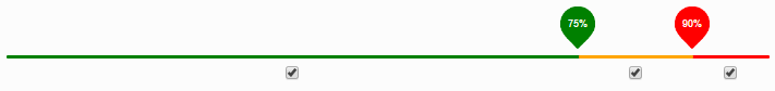
Colors are a way for you to highlight metrics that are important to you. In most cases, green means acceptable, amber means warning, and red means something needs attention. Each column is measured using percentiles. For example, if you scored in the 90th percentile, then 90% of the other participants scored better than you did. Or if you are in the 90th percentile of speeding events, then you had more speeding events than 90% of your peers.
When viewing columns with total counts, the total number of active vehicles or drivers within your peer group is factored in so that you are treated fairly regardless of the size of your group. It is expected that larger groups have a higher count of events, but may have a lower count of events per vehicle when compared to smaller groups. Some metrics, like Idle % and Score, do not factor in vehicle or driver counts because they are already normalized.
To adjust your percentile color range, move the percentile sliders in the Settings dialog box left or right.
Below is an example of a table that is counting the total number of hard acceleration events by department. For example, department 1 has 52 hard acceleration events and 23 vehicles.
Hierarchy |
Hard acceleration |
Idle % |
Number of vehicles |
|---|---|---|---|
Department 1 |
52 |
2 % |
23 |
Department 2 |
63 |
3 % |
25 |
Department 3 |
48 |
5 % |
31 |
Department 4 |
7 |
4 % |
5 |
Department 5 |
11 |
8 % |
8 |
Department 6 |
180 |
12 % |
120 |
Department 7 |
24 |
1 % |
13 |
Department 8 |
62 |
3 % |
35 |
Department 9 |
73 |
7 % |
21 |
Department 10 |
17 |
2 % |
10 |
Now consider the same table, normalized by vehicle count. For example, department 1 has 2.26 hard acceleration events per vehicle. This is calculated as follows: (52 HA events) / (23 Vehicles) = (2.26 HA events per vehicle). This table of normalized values makes it easier to see at a glance which departments have a higher occurrence of hard acceleration events.
Hierarchy |
Hard acceleration |
Idle % |
Number of vehicles |
|---|---|---|---|
Department 1 |
2.26 |
2 % |
23 |
Department 2 |
2.52 |
3 % |
25 |
Department 3 |
1.55 |
5 % |
31 |
Department 4 |
1.4 |
4 % |
5 |
Department 5 |
1.38 |
8 % |
8 |
Department 6 |
1.5 |
12 % |
120 |
Department 7 |
2.08 |
1 % |
13 |
Department 8 |
1.77 |
3 % |
35 |
Department 9 |
3.48 |
7 % |
21 |
Department 10 |
1.7 |
2 % |
10 |
 Previous
 Next
Next Expand/Collapse
 Print
Print Share Page
 Training
 Knowledge
 ) the size of the graph to full-screen, or shrink (
 ) the graph to its original, smaller size.
 to toggle the chart between chart and table views. The table view is useful if you need to copy data into a text editor or quickly view the raw data presented in a chart.